

Margaret Stanton
-
Posts
21 -
Joined
-
Last visited
Recent Profile Visitors

Margaret Stanton's Achievements
")
Nil Point! (1/8)
13
Reputation
-

Painting Outdoors on a Full Pallet Field Day
Margaret Stanton commented on Margaret Stanton's blog entry in Painting in Prague Blog
Now is the time to think about joining us in Prague for a week with five really good experienced artists, touring, painting, going to a village on a lake in northern Bohemia after the workshop, hanging out some more. Go to margaretstanton.com and get more info on Prague Art Escape. We're going to have a fantastic time and now it the time to decide to do it! We'd love to have you along. Maj and I are musicians, too, and plan to treat you to some great jazz in Prague. -
Painting Outdoors on a Full Pallet Field Day
Margaret Stanton posted a blog entry in Painting in Prague Blog
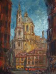
An artist, inspired to paint the Gothic and Florentine architecture outdoors in Prague, must choose between an almost limitless range of subtle colors to use. In this medieval city there are cooler hued buildings of stone with grayed lavenders, greens and blue browns. There are also warmer toned surfaces with ochre, yellows and oranges. Add to this an eclectic, no-rules range of color on many of the building's newly renovated surfaces, and you have a genuine, full palate field day! An artist needs to decide how to achieve color harmony in the shapes and nuances depicting these historic treasures if their next best painting is going to be a success. Rod Cameron reveals the secrets behind his choices of color in the painting titled, "St. Michelos Cathedral - Prague". Notice how he breaks down color into groups of "warm" and "cool". He tells students, "I saw the two towers in the sun as "warmer" mixtures: the thinner, taller steeple a mixture of cerulean blue and burnt sienna with white, and the main domed building a mixture of yellow ochre and burnt sienna with white." Using these warm hues as a reference point, Cameron uses a split complementary, which indicated blues, lavenders with touches of viridian green for the shadows and in the street buildings on either side. These cooler shadow colors frame the scene and provide exact compliments to the warm Hues of the Cathedral in the sunlight. To further enhance the warm atmosphere in the sunny part of this painting, the artist mixed cerulean blue into the sky. Cerulean blue, being the "warmer blue", supported the warm, sunny part of the composition and harmonized with the cerulean mixtures in the architecture. To see how easy it is to find and select complementary, split complementary and other color combinations, Rod Cameron suggests to artists to make or get a hold of a simple color wheel, found at any art supplier, and just dial up a color. In the case of Rod Cameron's painting of St. Michelos in Prague, he pointed to orange on the color wheel as his initial reference point, for the sunny surfaces of the Cathedral. The compliment of orange is ultramarine blue, but Cameron chooses the split complimentary; the colors that you find on either side of blue. The color wheel beautifully illustrates, lavenders on one side, and blues with a touch of viridian green on the other side; the split complimentary colors that Rod Cameron uses in the painting. Touches of your warm mixtures in your cool colors, and visa versa, will slightly gray things down, and go further to create great color harmony in your painting. The use of split complementary colors adds a greater range of color and more variety in your painting without sacrificing harmony. Color wheels are inexpensive and give the artist a better understanding of the color families and how they relate to each other. Even after you've memorized all the color combinations, it still fun to refer to now and then, plus, the wheel just looks cool hanging on the wall. Every studio should have one! Prague Artist Escape -
Painting Outdoors on a Full Pallet Field Day by Margaret Stanton An artist, inspired to paint the Gothic and Florentine architecture outdoors in Prague, must choose between an almost limitless range of subtle colors to use. In this medieval city, there are cooler hued buildings of stone with grayed lavenders, greens and blue browns. There are also warmer toned surfaces with ochre, yellows and oranges. Add to this an eclectic, no-rules range of color on many of the building's newly renovated surfaces, and you have a genuine, full palate field day! An artist needs to decide how to achieve color harmony in the shapes and nuances depicting these historic treasures if their next best painting is going to be a success. Rod Cameron reveals the secrets behind his choices of color in the painting titled, "St. Michelos Cathedral - Prague". Notice how he breaks down color into groups of "warm" and "cool". He tells students, "I saw the two towers in the sun as "warmer" mixtures: the thinner, taller steeple a mixture of cerulean blue and burnt sienna with white, and the main domed building a mixture of yellow ochre and burnt sienna with white." Using these warm hues as a reference point, Cameron uses a split complementary, which indicated blues, lavenders with touches of viridian green for the shadows and in the street buildings on either side. These cooler shadow colors frame the scene and provide exact compliments to the warm Hues of the Cathedral in the sunlight. To further enhance the warm atmosphere in the sunny part of this painting, the artist mixed cerulean blue into the sky. Cerulean blue, being the "warmer blue", supported the warm, sunny part of the composition and harmonized with the cerulean mixtures in the architecture. To see how easy it is to find and select complementary, split complementary and other color combinations, Rod Cameron suggests to artists to make or get a hold of a simple color wheel, found at any art supplier, and just dial up a color. In the case of Rod Cameron's painting of St. Michelos in Prague, he pointed to orange on the color wheel as his initial reference point, for the sunny surfaces of the Cathedral. The compliment of orange is ultramarine blue, but Cameron chooses the split complimentary; the colors that you find on either side of blue. The color wheel beautifully illustrates, lavenders on one side, and blues with a touch of viridian green on the other side; the split complimentary colors that Rod Cameron uses in the painting. Touches of your warm mixtures in your cool colors, and visa versa, will slightly gray things down, and go further to create great color harmony in your painting. The use of split complementary colors adds a greater range of color and more variety in your painting without sacrificing harmony. Color wheels are inexpensive and give the artist a better understanding of the color families and how they relate to each other. Even after you've memorized all the color combinations, it still fun to refer to now and then, plus, the wheel just looks cool hanging on the wall. Every studio should have one! Prague Art Escape This post has been promoted to an article
-
Painting Outdoors on a Full Pallet Field Day by Margaret Stanton An artist, inspired to paint the Gothic and Florentine architecture outdoors in Prague, must choose between an almost limitless range of subtle colors to use. In this medieval city, there are cooler hued buildings of stone with grayed lavenders, greens and blue browns. There are also warmer toned surfaces with ochre, yellows and oranges. Add to this an eclectic, no-rules range of color on many of the building's newly renovated surfaces, and you have a genuine, full palate field day! An artist needs to decide how to achieve color harmony in the shapes and nuances depicting these historic treasures if their next best painting is going to be a success. Rod Cameron reveals the secrets behind his choices of color in the painting titled, "St. Michelos Cathedral - Prague". Notice how he breaks down color into groups of "warm" and "cool". He tells students, "I saw the two towers in the sun as "warmer" mixtures: the thinner, taller steeple a mixture of cerulean blue and burnt sienna with white, and the main domed building a mixture of yellow ochre and burnt sienna with white." Using these warm hues as a reference point, Cameron uses a split complementary, which indicated blues, lavenders with touches of viridian green for the shadows and in the street buildings on either side. These cooler shadow colors frame the scene and provide exact compliments to the warm Hues of the Cathedral in the sunlight. To further enhance the warm atmosphere in the sunny part of this painting, the artist mixed cerulean blue into the sky. Cerulean blue, being the "warmer blue", supported the warm, sunny part of the composition and harmonized with the cerulean mixtures in the architecture. To see how easy it is to find and select complementary, split complementary and other color combinations, Rod Cameron suggests to artists to make or get a hold of a simple color wheel, found at any art supplier, and just dial up a color. In the case of Rod Cameron's painting of St. Michelos in Prague, he pointed to orange on the color wheel as his initial reference point, for the sunny surfaces of the Cathedral. The compliment of orange is ultramarine blue, but Cameron chooses the split complimentary; the colors that you find on either side of blue. The color wheel beautifully illustrates, lavenders on one side, and blues with a touch of viridian green on the other side; the split complimentary colors that Rod Cameron uses in the painting. Touches of your warm mixtures in your cool colors, and visa versa, will slightly gray things down, and go further to create great color harmony in your painting. The use of split complementary colors adds a greater range of color and more variety in your painting without sacrificing harmony. Color wheels are inexpensive and give the artist a better understanding of the color families and how they relate to each other. Even after you've memorized all the color combinations, it still fun to refer to now and then, plus, the wheel just looks cool hanging on the wall. Every studio should have one!
-
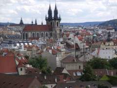
Tour Prague with Artists
Images added to a gallery album owned by Margaret Stanton in Members Albums - Index Page
Painting and Touring Prague with master landscape and figure painting artist Rod Cameron and contemporary artist Margaret Stanton and Prague native Jiri Balej May 25 - 31, 2010. 5 day 6 night Painting workshop in Prague -
-
Great Artist Tip for Painting Shadows
Margaret Stanton posted a blog entry in Painting in Prague Blog
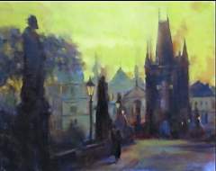
In an early morning painting on the famous Charles Bridge in Prague, Czech Republic, the shadows are made up of warm colors. Artist, Rod Cameron, offers this insight into the color temperature that he used in the painting, and gives artists a good rule of thumb when selecting colors for shadows. At sunrise and sunset, the color of the light is changing very quickly. For even very ambitious plein air painters who manage to set up their easels at the crack of dawn, it's nearly impossible to finish the painting and capture the lighting effects on the landscape before it changes. And it's hard to remember exactly how it looked when you got the inspiration for your creation. Rod Cameron, travels with other artists all the way from his home on the Big Island in Hawaii to central Europe and the Czech and Slovak Republics, to paint in Prague. Knowing how to handle the shadows in certain colored light can be very helpful when painting en plein air, and the time and the light is moving too fast. Rod Cameron tells his students, "The magical light of Prague this early in the morning had a cool predominate cast, which brings the shadows to the warmer hues of the palate. Cool light equals warm shadows, or warm light gives cool shadows. This is the general rule." See Painting Even experienced plein air painting artists can benefit from this little reminder, especially when it's early, and you're in the moment. You want to capture the look and feel of cool, early morning, before the sun is up, and a few good rules of thumb can help take the guesswork out! "The incredible buildings of the city create an interesting sky line across the horizon and I used the tall statue on the left, which had a natural gaze into the scene and the focal points of the painting," said Rod Cameron while describing his painting titled, Charles Bridge. This Rod Cameron painting of the Charles bridge in Prague can be found on the web. Go ahead! Travel halfway around the world. Get up at the crack of dawn, and capture in your paintings the beautiful places that you travel to with confidence! The light may be changing too quickly, but the architecture, skylines and statues aren't. Create great value and color harmony with complimentary colors, then nudge the color in the shadows either warm or cool. Notice that it gives your shadows a "real presence". Painting Tip, Plein Air Painting in Europe, Expert advise on Painting, Painting Shadows, Painting workshop, Rod Cameron Art, -
In an early morning painting on the famous Charles Bridge in Prague, Czech Republic, the shadows are made up of warm colors. Artist, Rod Cameron, offers this insight into the color temperature that he used in the painting, and gives artists a good rule of thumb when selecting colors for shadows. At sunrise and sunset, the color of the light is changing very quickly. For even very ambitious plein air painters who manage to set up their easels at the crack of dawn, it's nearly impossible to finish the painting and capture the lighting effects on the landscape before it changes. And it's hard to remember exactly how it looked when you got the inspiration for your creation. Rod Cameron, travels with other artists all the way from his home on the Big Island in Hawaii to central Europe and the Czech and Slovak Republics, to paint in Prague. Knowing how to handle the shadows in certain colored light can be very helpful when painting en plein air, and the time and the light is moving too fast. Rod Cameron tells his students, "The magical light of Prague this early in the morning had a cool predominate cast, which brings the shadows to the warmer hues of the palate. Cool light equals warm shadows, or warm light gives cool shadows. This is the general rule." Even experienced plein air painting artists can benefit from this little reminder, especially when it's early, and you're in the moment. You want to capture the look and feel of cool, early morning, before the sun is up, and a few good rules of thumb can help take the guesswork out! "The incredible buildings of the city create an interesting sky line across the horizon and I used the tall statue on the left, which had a natural gaze into the scene and the focal points of the painting," said Rod Cameron while describing his painting titled, Charles Bridge. This Rod Cameron painting of the Charles bridge in Prague can be found on the web. Go ahead! Travel halfway around the world. Get up at the crack of dawn, and capture in your paintings the beautiful places that you travel to with confidence! The light may be changing too quickly, but the architecture, skylines and statues aren't. Create great value and color harmony with complimentary colors, then nudge the color in the shadows either warm or cool. Notice that it gives your shadows a "real presence" . Painting Tip, Plein Air Painting in Europe, Expert advise on Painting, Painting Shadows, Painting workshop, Rod Cameron Art, This post has been promoted to an article
-
In an early morning painting on the famous Charles Bridge in Prague, Czech Republic, the shadows are made up of warm colors. Artist, Rod Cameron, offers this insight into the color temperature that he used in the painting, and gives artists a good rule of thumb when selecting colors for shadows. At sunrise and sunset, the color of the light is changing very quickly. For even very ambitious plein air painters who manage to set up their easels at the crack of dawn, it's nearly impossible to finish the painting and capture the lighting effects on the landscape before it changes. And it's hard to remember exactly how it looked when you got the inspiration for your creation. Rod Cameron, travels with other artists all the way from his home on the Big Island in Hawaii to central Europe and the Czech and Slovak Republics, to paint in Prague. Knowing how to handle the shadows in certain colored light can be very helpful when painting en plein air, and the time and the light is moving too fast. Rod Cameron tells his students, "The magical light of Prague this early in the morning had a cool predominate cast, which brings the shadows to the warmer hues of the palate. Cool light equals warm shadows, or warm light gives cool shadows. This is the general rule." Even experienced plein air painting artists can benefit from this little reminder, especially when it's early, and you're in the moment. You want to capture the look and feel of cool, early morning, before the sun is up, and a few good rules of thumb can help take the guesswork out! "The incredible buildings of the city create an interesting sky line across the horizon and I used the tall statue on the left, which had a natural gaze into the scene and the focal points of the painting," said Rod Cameron while describing his painting titled, Charles Bridge. This Rod Cameron painting of the Charles bridge in Prague can be found on the web. Go ahead! Travel halfway around the world. Get up at the crack of dawn, and capture in your paintings the beautiful places that you travel to with confidence! The light may be changing too quickly, but the architecture, skylines and statues aren't. Create great value and color harmony with complimentary colors, then nudge the color in the shadows either warm or cool. Notice that it gives your shadows a "real presence" . Painting Tip, Plein Air Painting in Europe, Expert advise on Painting, Painting Shadows, Painting workshop, Rod Cameron Art,
-
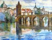
Charles Bridge in Prague
Margaret Stanton commented on Margaret Stanton's gallery image in Members Albums - Index Page
 Read a painting tip on this early morning painting in Prague, by Rod Cameron. This Spring with Prague Artist Escape you will travel to Prague, the capital city of the Czech Republic, for a six-night stay and learn plein air painting techniques from award winning artists Rod Cameron and Margaret Stanton, who along with Prague native Jiri Balej, host this exciting, unique tour in one of the most beautiful cities in Europe. Guests of each artist are welcomed! Guests pay only for their hotel room, save money on accommodations and food, and enjoy all the daily walking tours and excursions.
 -
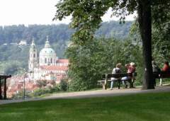
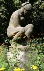
Sculpture in Prague Letna Park
Margaret Stanton commented on Margaret Stanton's gallery image in Members Albums - Index Page
I love to stop and sit by this oval garden with this statue of a woman. It's in a very lovely place on Letna, near the huge beer garden in the park. The whole place looks out over the Vltava River to Prague's Old Town area. This is the beginning of our walk through the park to Prague Castle. -
Let us show you Prague and How to Paint the Town!
Margaret Stanton posted a blog entry in Painting in Prague Blog
If you're an Artist and have dreamed of going to Prague, This could be the trip you have been waiting for. Artist's Dream Holiday Plein Air Painting in Prague. OPEN to 10 artists and their guests. May 25 - 31, 2010. Join Artist Rod Cameron and Prague native, Jiri Balej, together with Artist Margaret Stanton for an exciting 5 day/6nights of painting, photographing and touring this exquisite, old European capital in a fun, relaxed atmosphere! This painting workshop/tour includes three star hotel accommodations with amenities in the heart of Prague (one block from MoMA), 5 days of painting workshops with Rod Cameron in different locations, 2 evening figure painting sessions, Daily sightseeing tours, personal instruction, Airport meet and greet, train ride excursion & savings on food and entertainment. Register Now! at Trip to Prague Info Take your Art to new levels with this amazing 5 day/ 6 night Plein Air Painting Workshop/Tour in the Heart of Prague Let us show you Prague and how to paint the Town! Let me know what you think, and Check Back to see more pictures, plus read about the people and how you can join us on this Great Tour of Prague! -
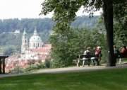
Prague Plein Air Painting
Images added to a gallery album owned by Margaret Stanton in Members Albums - Index Page
Exciting 5 day/6 night Plein Air Painting Excursion in Prague May 25 - 31, 2010 Contact Margaret Stanton for details. -
-
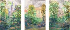
Web_Tryptich.jpg
Margaret Stanton commented on Margaret Stanton's gallery image in Members Albums - Index Page
Prague Tour offers the best sites in Prague for plein air painting hosted by Artist Margaret Stanton and Rod Cameron

-
Who's Online 0 Members, 0 Anonymous, 225 Guests (See full list)
- There are no registered users currently online